If you run a rental business, you already sit on a goldmine: every order tells you something about a customer. Who rents often and spends a lot. Who came once and never returned. Who used to come twice a week and then quietly disappeared.
The problem is that this information only becomes useful when you can actually see it. And a list of hundreds of orders doesn’t answer the important questions: who are my best customers, who is at risk of leaving, and what makes people come back?
That’s exactly what customer analytics in Turborent is for — one page, five views built from your order history. No spreadsheets, no clever formulas.
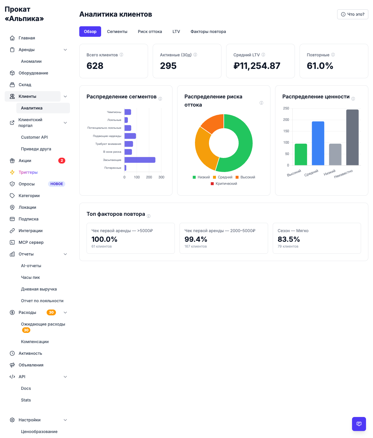
Let’s walk through them using a demo rental business — «Прокат «Альпика» with 628 customers and just over 1,500 orders.
Segments: who your customers are
The first view divides all customers into eight classic RFM segments based on how recently they rented, how often, and how much they spend:
- Champions — your best customers: rent often and spend a lot;
- Loyal — regulars who keep coming back;
- Potential Loyalists — recent customers who should be turned into regulars;
- Promising — new and low-spend customers worth nurturing;
- Need Attention — customers who were active but are starting to slip;
- At Risk — used to be great, but haven’t returned for a while;
- Hibernating — unlikely to come back on their own;
- Lost — virtually gone.
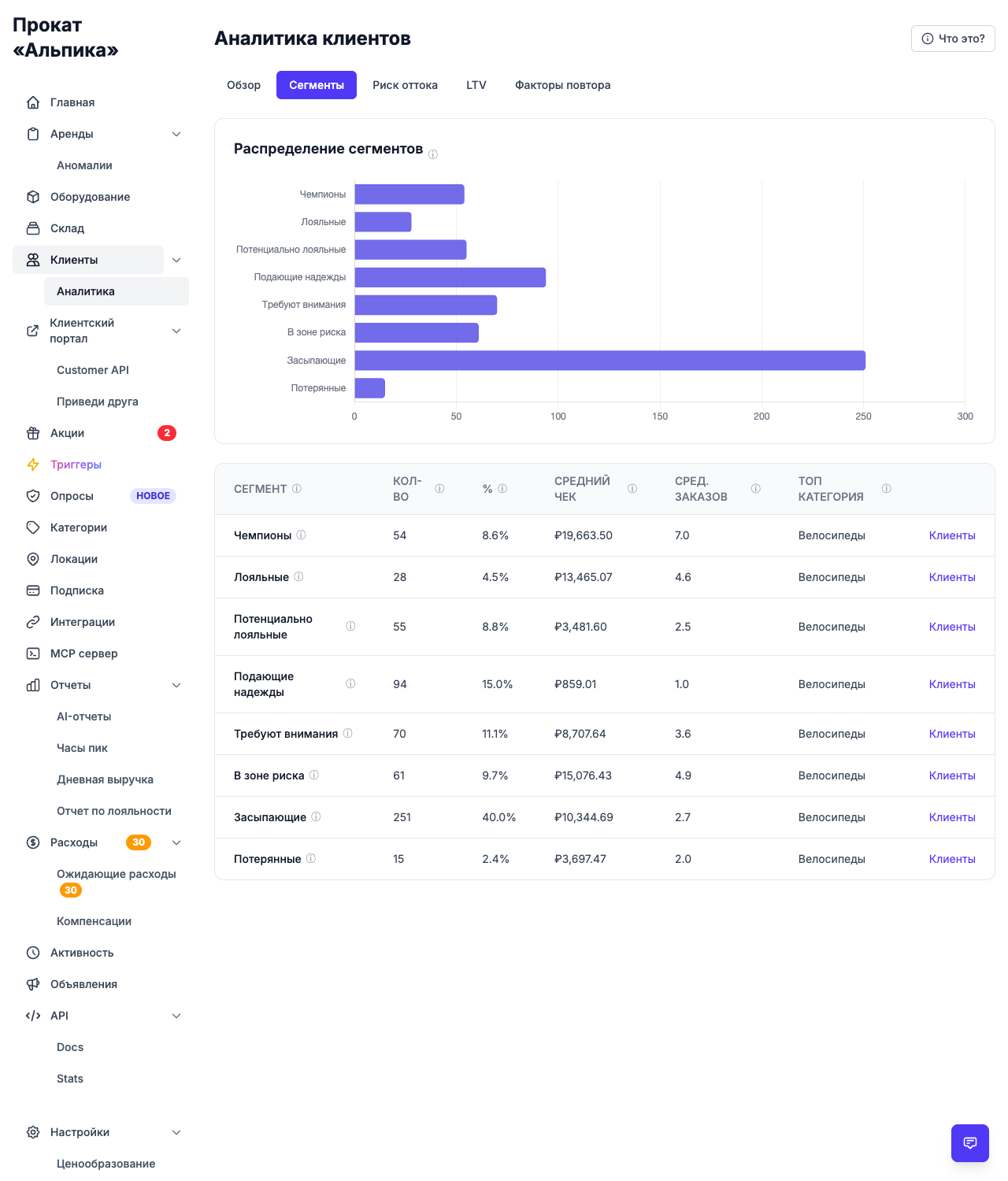
The key thing is that each segment implies a very different action. Champions need recognition and rewards. Potential loyalists need a second visit — a small bonus often decides it. At-risk customers need to be brought back before they’re gone for good.
You don’t need to guess who belongs where — the page shows the count and share of every segment right away, along with the equipment categories each one prefers.
Churn: who is about to disappear
No business likes to hear this, but some of your customers are leaving — they just haven’t done it out loud yet. The churn view scores every customer and puts them into four buckets: low, medium, high and critical risk.
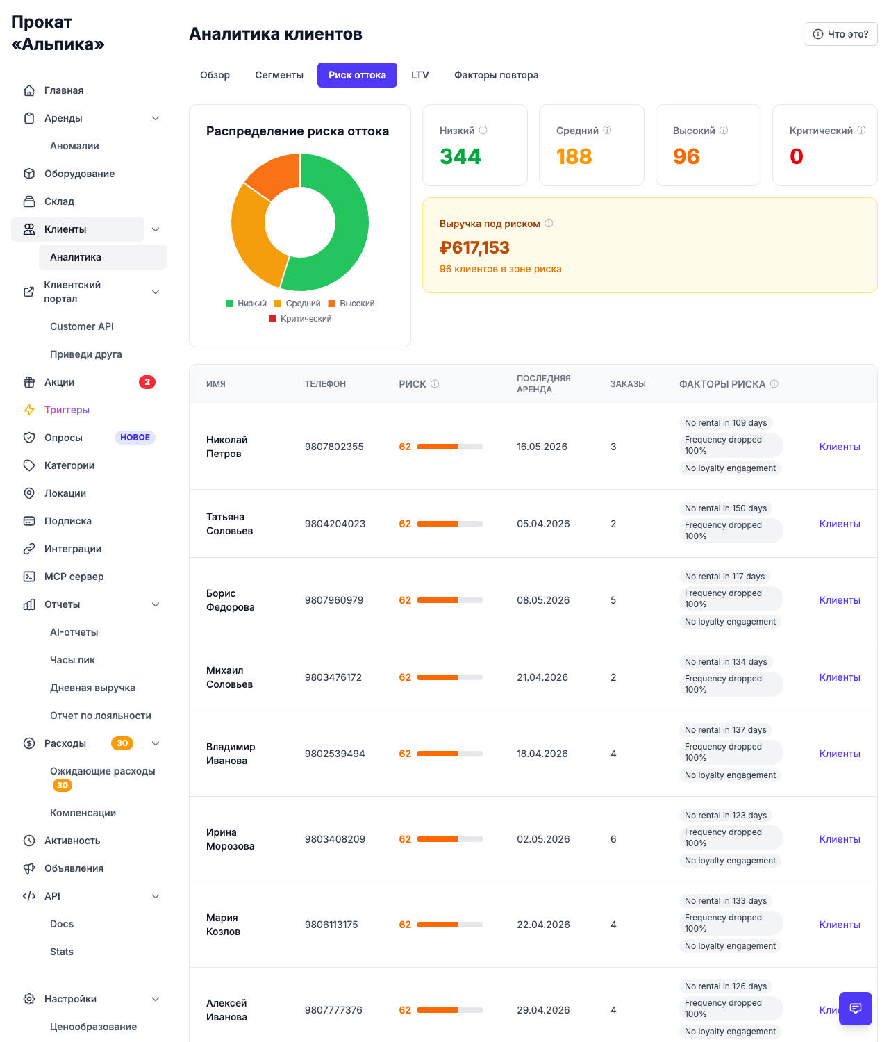
In our example, 96 customers are currently in the high-risk zone, and the revenue they represent is shown directly on the page — over ₽617,000 that could be lost if they don’t return.
This is where analytics hands off to another feature: once you know who is at risk, you can set up win-back triggers that automatically send a message to each of them. Understanding who is at risk is the first half; doing something about it is the second. (We covered win-back triggers in a separate article.)
Projected LTV: how much a customer is worth
A customer who rented once for 15 minutes and a customer who rents two times a week are very different in value — and both costs the same to attract. The projected LTV view estimates what each customer is worth over the next 12 months, and shows the whole picture as a histogram.
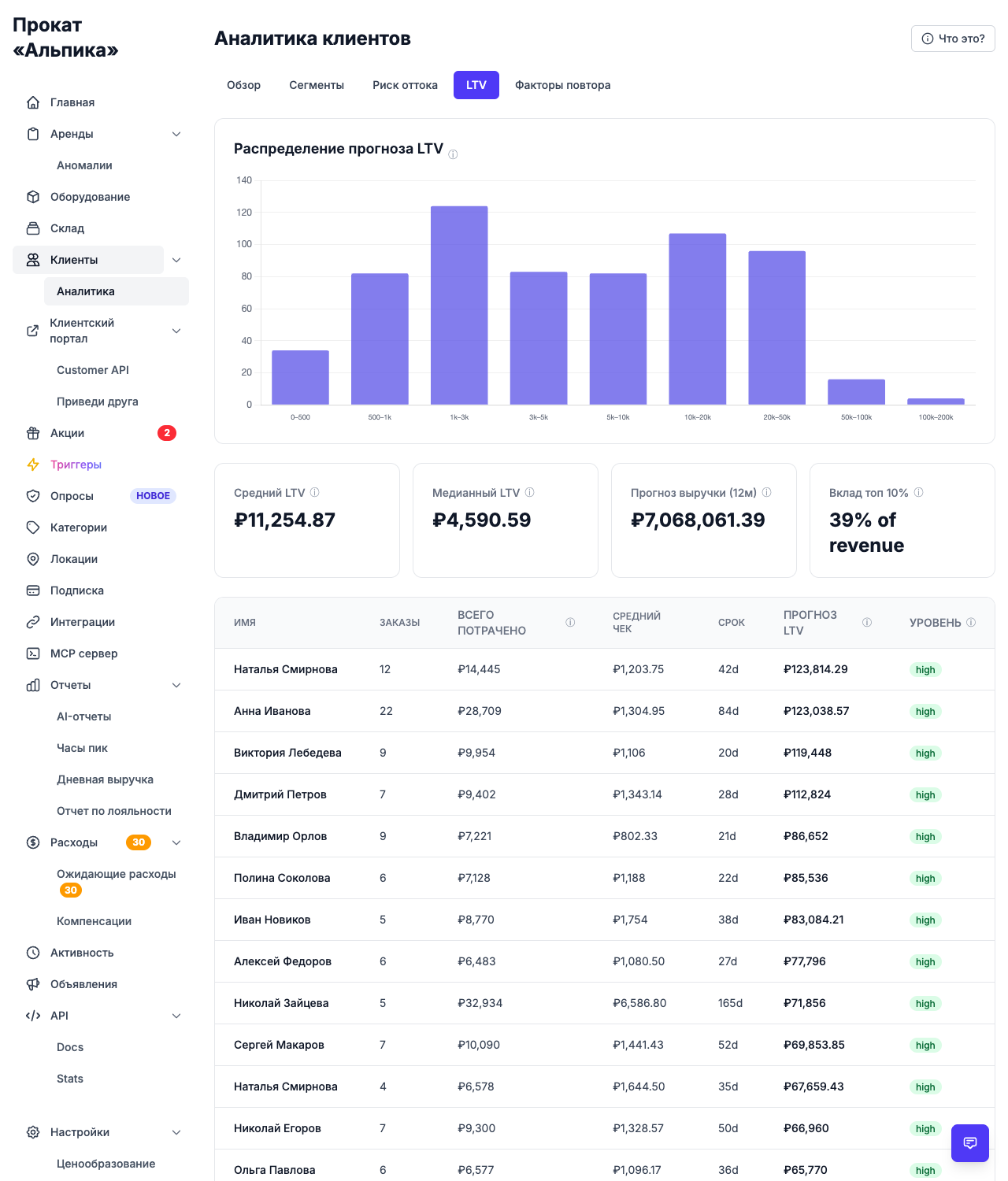
For Альпика the median projected LTV is ₽4,591 per customer, while the top 10% of customers bring in about 39% of all revenue. Those are the numbers that justify loyalty programs, personal discounts, and extra attention.
The view also marks customers who simply don’t have enough history yet — a customer with a single rental can’t be graded fairly, and the page says so instead of inventing a number.
Repeat-rate drivers: what makes people come back
The most practical view answers the question: what do returning customers have in common? It compares groups of customers across nine factors and shows the repeat rate for each group against the overall average.
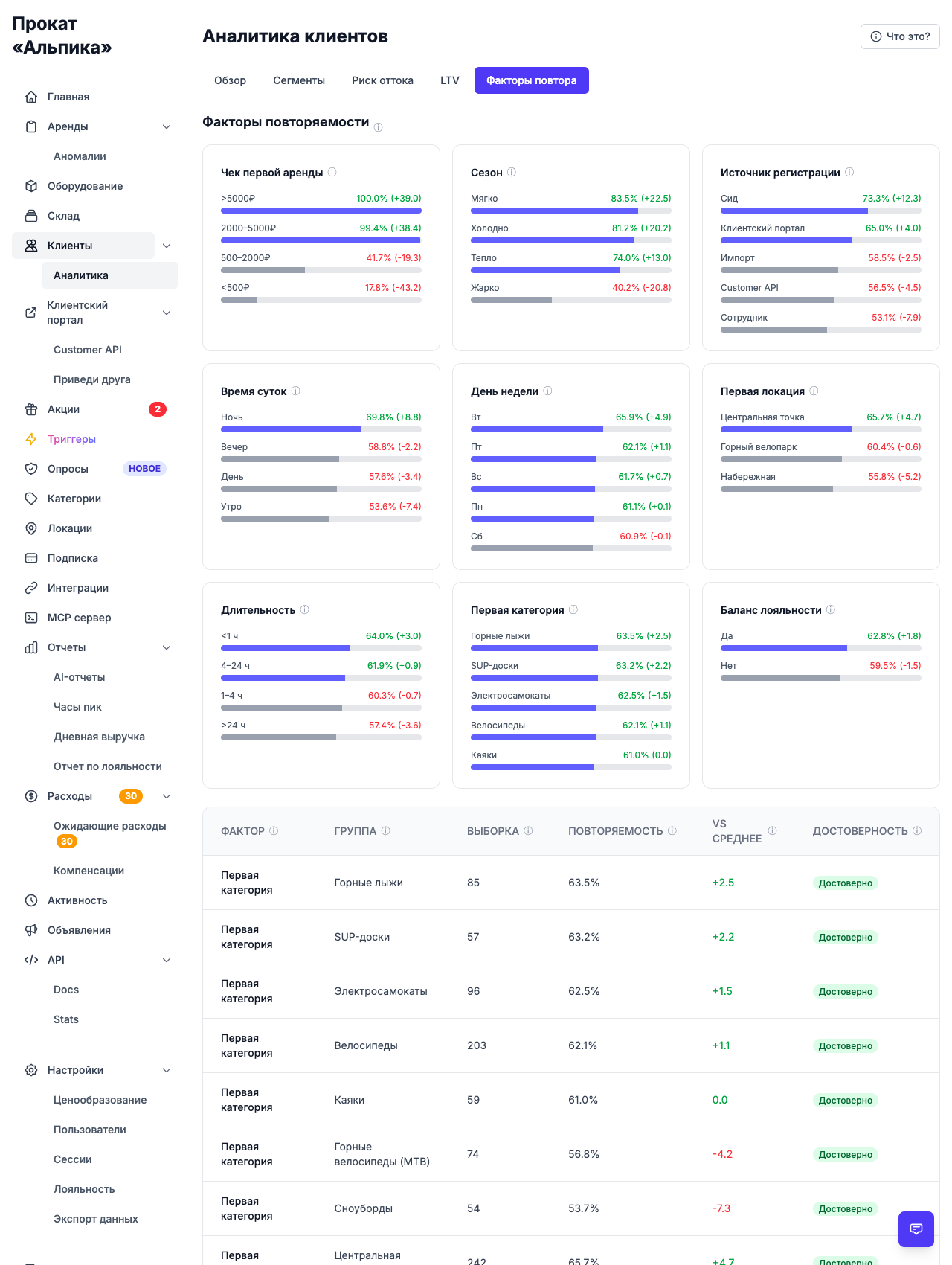
Consider what the numbers revealed for Альпика:
- overall repeat rate is 61%;
- customers whose first rental started at the «Центральная точка» location return at 65.7%, while those from «Набережная» return at 55.8% — and this difference tells the team to look at what’s different about that location (staff, assortment, location);
- customers who spent over ₽5,000 on their first rental come back almost every time; customers who spent less than ₽500 return far more rarely — the numbers make it obvious where a good first impression (or a good first upsell) pays off;
- there’s also a clear gap between categories: people who first rented skis come back at 63.5%, while snowboard customers return at 53.7%.
These are not opinions — they’re the actual groups hidden in your order history. Knowing them, you can focus effort where it moves the needle: train staff at a weak location, rethink the first-rental experience, or adjust your assortment.
Overview: the whole picture on one screen
Finally, the overview tab puts the three most important distributions side by side — segments, churn risk and projected value — above the key numbers: how many customers rented in the last 30 days, what the average projected LTV is, and what the overall repeat rate looks like. A quick scan is enough to answer “how is my customer base doing?” at any moment.
Turning numbers into actions
Analytics is only worth something when it changes what you do next. Practical examples with these views:
- Reward your Champions — a loyalty balance, priority booking, or a personal bonus costs little and protects your highest revenue;
- Nurture Potential Loyalists and Promising customers — a second rental is decided by a small nudge, like a promo code in a message;
- Save At Risk customers before they leave — they already know your service, and winning them back is cheaper than acquiring a new customer;
- Work with what the drivers show — weak location, low first-check problem, unpopular category: pick one factor and improve it;
- Compare segments over time — if Hibernating grows, your retention is slipping; catch it early;
- Use churn and win-back together — the churn view shows who to message, triggers send the message automatically.
The bottom line
A business that knows its customers makes better decisions — where to invest, whom to reward, what to improve. Customer analytics in Turborent turns the order history you already have into those decisions.
No formulas, no manual counting: open the page, look at five tabs, and you’ll know who your best customers are, who is about to leave, what a customer is worth, and what makes people come back. And then — what to do about all of it.
Create a free organization and look at your own analytics. It takes about a minute to set up.